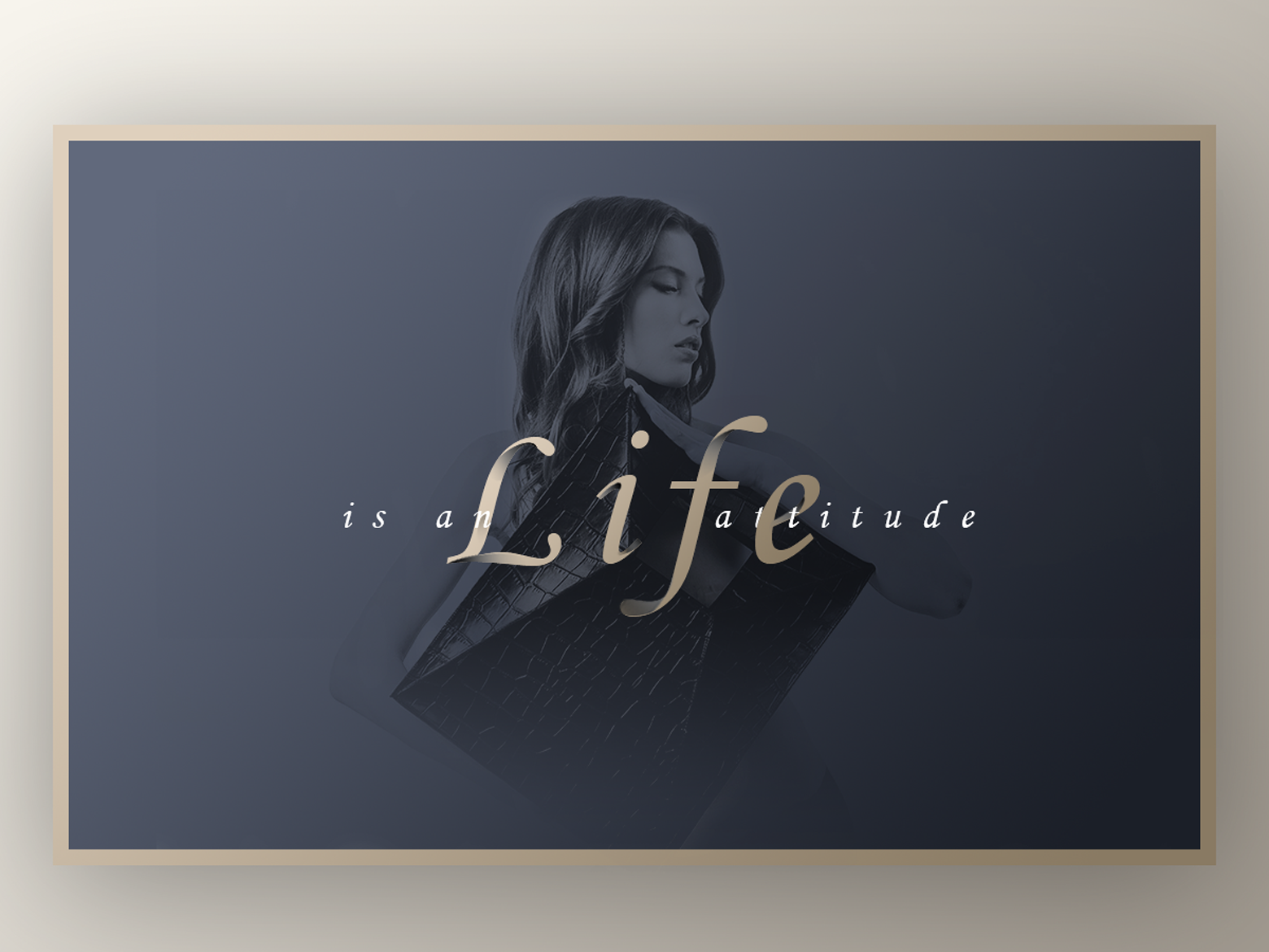
​之前一直困惑那种看似纯色的背景是怎么做到有种高大上的感觉,让Banner看起来更具有质感,自从在设计达人看到过一篇关于“ 设计漂亮质感的BANNER图(附教程素材下载)”的文章教程后,谜底终于解开——原来关键在于渐变叠加加上颜色时,光线方向要统一。

交作业啦~ ~ ~

Privacy Settings
We use cookies to enhance your experience while using our website. If you are using our Services via a browser you can restrict, block or remove cookies through your web browser settings. We also use content and scripts from third parties that may use tracking technologies. You can selectively provide your consent below to allow such third party embeds. For complete information about the cookies we use, data we collect and how we process them, please check our Privacy Policy
Youtube
Consent to display content from Youtube
Vimeo
Consent to display content from Vimeo
Google Maps
Consent to display content from Google
Spotify
Consent to display content from Spotify
Sound Cloud
Consent to display content from Sound
Cart Overview